Steeping the Spinner: A Tea-Rack Colour Ramp for Loading States
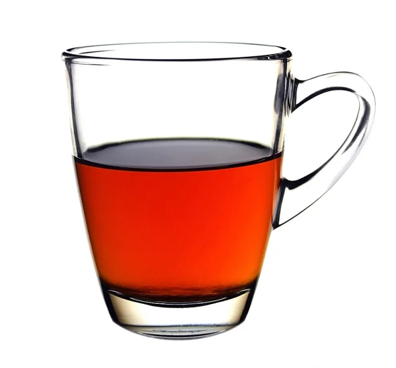
Photo: AntanO, CC BY-SA 4.0, via Wikimedia Commons
Loading states are the hold music of the web: everyone notices when they are bad, nobody notices when they are fine. Most sites reach for the same blue spinner. Fair enough. But a progress bar is also interface furniture, and in the UK we have a perfectly good colour scale sitting on the kitchen counter: the builder’s brew.
This is not a plea to make every dashboard look like a mug. It is a practical way to build a warm, familiar loading ramp that still behaves in light mode, dark mode, and the awkward bits in between. We will sample a tea spectrum, turn it into OKLCH tokens, test contrast, and ship a small progress component. No milk-first arguments required.
Start with a proper brew, not a mood board
A tea ramp is not arbitrary. If you photograph the same white cup every minute or so, you get a natural lightness curve: pale straw, golden, biscuit, amber, copper, mahogany. Use daylight, keep the cup and camera still, and avoid filters. Then sample the centre of the liquid with an eyedropper and convert the results to OKLCH.
What you are looking for is not a perfect copy of one mug. It is a smooth set of steps with a consistent hue, a chroma curve that rises through the mid-tones and falls away in the dark end, and enough separation to use as UI tokens. In OKLCH, that means keeping hue somewhere around 70 to 80 degrees for the warm tea note, then nudging chroma down as lightness drops. A little variation is good. Too much and your ramp becomes a fruit bowl.
Name the primitive steps plainly: --tea-0 through --tea-6. Give them human labels in your design notes, such as pale straw, first steep, builder’s, strong, and over-stewed. The labels help conversation. The numbered tokens help code.
The ramp, in OKLCH
Here is a workable starting point. Treat it as a sketch, not a law. Your cup, your screen, and your brand will shift the numbers.
:root {
  --tea-0: oklch(0.97 0.012 82); /* pale straw */
  --tea-1: oklch(0.91 0.035 78); /* first steep */
  --tea-2: oklch(0.82 0.060 72); /* milky tan */
  --tea-3: oklch(0.72 0.085 65); /* biscuit */
  --tea-4: oklch(0.61 0.100 55); /* builder’s */
  --tea-5: oklch(0.50 0.095 45); /* strong */
  --tea-6: oklch(0.39 0.075 38); /* over-stewed mahogany */
}
The point of using OKLCH is not to sound clever in a pull request. It gives you lightness steps that behave more predictably when you swap a fill for a track, or a light-mode token for a dark-mode one. You can still fall back to hex if you must, but keep the OKLCH source as the source of truth.
Contrast is the milk
A progress bar has two jobs: show that something is happening, and show how much has happened. Colour alone cannot do either job reliably. You need a visible track, a visible fill, and a text or ARIA label for anyone who cannot see the difference.
For non-text UI, aim for at least 3:1 between the fill and the track, and between the whole bar and its surroundings. If you put a percentage label next to the bar, that text needs 4.5:1 against its background. Do not assume that a pretty tea tan will pass just because it looks dark on your monitor. Test it.
In practice, a light-mode pairing of --tea-1 for the track and --tea-5 for the fill usually gives you a clear step without turning the page into a brown smear. In dark mode, flip the relationship: use a deep track and a lighter fill, but keep the fill warm rather than washing it out to grey.
Dark mode: turn the lights down, not the saturation
Dark mode is where tea ramps often go wrong. People invert the whole scale and end up with a muddy brown bar on a near-black page. A better approach is to choose tokens specifically for the dark theme, then wire them through semantic variables.
:root {
  --progress-track: var(--tea-1);
  --progress-fill: var(--tea-5);
  --progress-label: var(--tea-6);
}

@media (prefers-color-scheme: dark) {
  :root {
    --progress-track: var(--tea-6);
    --progress-fill: var(--tea-2);
    --progress-label: var(--tea-1);
  }
}
This keeps the component code simple. The primitive tea tokens stay fixed; the semantic tokens do the theme work. If your site has a manual theme switcher, set the same variables under a [data-theme='dark'] selector and you are done.
A small component that behaves
The markup should expose progress to assistive technology rather than pretending to be a decorative div. Keep it small and boring in the best way.
<div class='tea-progress' role='progressbar' aria-valuemin='0' aria-valuemax='100' aria-valuenow='0' aria-label='Loading dashboard'>
  <div class='tea-progress__track'>
    <div class='tea-progress__fill'></div>
  </div>
  <span class='tea-progress__label'>0%</span>
</div>
.tea-progress {
  display: grid;
  gap: 0.5rem;
  font: 0.875rem/1.4 system-ui, sans-serif;
  color: var(--progress-label);
}

.tea-progress__track {
  height: 0.75rem;
  border-radius: 999px;
  background: var(--progress-track);
  overflow: hidden;
}

.tea-progress__fill {
  height: 100%;
  width: 0%;
  border-radius: inherit;
  background: var(--progress-fill);
  transition: width 240ms ease;
}

@media (prefers-reduced-motion: reduce) {
  .tea-progress__fill {
    transition: none;
  }
}
const bar = document.querySelector('.tea-progress');
const fill = bar.querySelector('.tea-progress__fill');
const label = bar.querySelector('.tea-progress__label');

function setProgress(value) {
  const clamped = Math.max(0, Math.min(100, value));
  bar.setAttribute('aria-valuenow', String(clamped));
  fill.style.width = clamped + '%';
  label.textContent = Math.round(clamped) + '%';
}

setProgress(38);
For an indeterminate state, do not fake a percentage. Swap in a looping gradient or a subtle moving band between --tea-2 and --tea-4, pause it under prefers-reduced-motion, and keep the ARIA label honest. A loading bar that lies is worse than a spinner.
Don’t over-stew it
The tea rack works because it is familiar without being cute. It gives you a warm ramp for progress bars, skeletons, and loading states that does not look like every other SaaS dashboard. But the colour is only half the job. Test your contrast pairs, expose the progress value, respect reduced motion, and make sure the component still reads when someone has turned on high contrast mode.
And if you are going to argue about milk first, do it after the build passes.