Ten High-Street Colour Recipes, From Chip Paper Cream to Chemist Cross Green
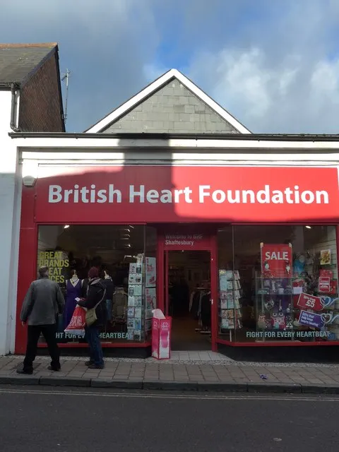
Photo: Basher Eyre , CC BY-SA 2.0, via Wikimedia Commons
The UK high street is a colour system that nobody designed. A chippy, a chemist, a launderette and a bookmaker all solve different problems with paint, plastic and vinyl, and the results are often more useful than a moodboard. The trick is to borrow the logic, not the wistfulness. Sample the colours, simplify them, then test them like a grown-up.
Sample, simplify, then test
Take a phone photo in flat light. Crop to the paintwork, paper and signage rather than the whole scene. Blur it, pick five swatches, and give each one a job: surface, ink, muted, accent, focus. Ten shopfronts should not produce ten decorative themes. They should produce ten small sets of tokens you can actually ship. Contrast comes first; nostalgia can wait outside with a can of pop.
1. The chippy: vinegar paper and batter gold
Start with the paper, not the neon. A good chippy palette is cream, salt-white, batter gold and a red that means brown sauce, not emergency. Use the ink for text, the red for prices and borders, and keep the gold away from body copy.
2. The chemist: cross green and plaster white
Chemist green is not a brand; it is a signal. Pair it with plaster white and label grey, then keep the green for headings and the cross. Check that green against white at body size. If it fails, darken it rather than adding a shadow.
3. The greengrocer: crate wood and cabbage leaf
Greengrocer colour is mostly packaging and produce. Use chalkboard for text, kraft for surfaces, and let the greens and oranges shout in small areas. Do not make the whole site carrot orange; that is a recipe for a headache with a side of parsley.
4. The launderette: powder blue and spin-cycle red
Launderette palettes work because they are clean. Powder blue, machine white, lint grey and one red for the timer. Keep large surfaces pale and use red sparingly, especially near forms and error states.
5. The barber: pole red, mirror silver, comb black
The barber pole is a stripe, not a background. Sample the red and blue, then desaturate the blue for UI. Use black for type and silver as a border, not a text colour. The pole can live in a small illustration; the interface needs calm.
6. The bakery: crust brown and jam red
Bakery colour should feel baked, not beige. Crust brown, flour white, jam red and a paper doily cream. Use brown for headings and flour for surfaces; jam is for buttons and alerts. If everything is brown, you have made a loaf, not a layout.
7. The newsagent: magazine magenta and lottery yellow
Newsagents are controlled chaos. Pick one loud magazine colour and one lottery yellow, then anchor them with shelf grey and ink. Never put yellow text on white. Yellow is a highlight, a sticker, a small dose of Saturday energy.
8. The hardware shop: bucket blue and zinc grey
Hardware shops give you useful industrial blues and greys. Use bucket blue for links, zinc for dividers, terracotta for warmth and twine for highlights. Test the blue on grey; it can go muddy faster than a puddle outside the door.
9. The bookmaker: track green and betting-slip cream
Bookmaker green is a surface colour, not a text colour. Pair it with slip cream and pencil grey, and keep odds red for small, high-contrast moments. Do not recreate a flashing odds board. The interesting part is the paper, not the panic.
10. The charity shop: sticker yellow and donated teal
Charity shop windows are collages. Take the sticker yellow, a donated teal, tag cream and rail chrome. Use yellow as a highlight, not a page background, and check teal against cream before you commit. The rail chrome is for borders and focus rings.
:root {
  --chippy-paper: #f6ead2;
  --chippy-ink: #211a16;
  --chippy-batter: #d99a2b;
  --chippy-counter: #9e2a22;
  --chippy-vinegar: #fffaf0;

  --chemist-plaster: #f7f7f2;
  --chemist-ink: #17211c;
  --chemist-cross: #007a53;
  --chemist-label: #6b746f;
  --chemist-pill: #dce8f2;

  --greengrocer-kraft: #d8b98d;
  --greengrocer-ink: #1f211b;
  --greengrocer-cabbage: #5f7f3a;
  --greengrocer-carrot: #c95d24;
  --greengrocer-chalk: #f4f1e7;

  --launderette-powder: #cfe4ee;
  --launderette-ink: #1b2529;
  --launderette-white: #fbfcfc;
  --launderette-lint: #aeb8bc;
  --launderette-spin: #c33c3c;

  --barber-red: #b8323c;
  --barber-blue: #2f5f9e;
  --barber-black: #171717;
  --barber-silver: #c9ced1;
  --barber-tile: #f0eeea;

  --bakery-crust: #8a5a2b;
  --bakery-flour: #f5efe3;
  --bakery-jam: #a62f3c;
  --bakery-ink: #2a211b;
  --bakery-doily: #e8dcc8;

  --newsagent-magenta: #c62d79;
  --newsagent-ink: #161616;
  --newsagent-shelf: #8b9295;
  --newsagent-lottery: #f2c94c;
  --newsagent-paper: #f7f5ef;

  --hardware-bucket: #2d6f9e;
  --hardware-zinc: #8e999e;
  --hardware-terracotta: #b45f3c;
  --hardware-twine: #d8c4a2;
  --hardware-ink: #1d2325;

  --bookmaker-track: #1f5d42;
  --bookmaker-slip: #f1e3c6;
  --bookmaker-pencil: #5e6363;
  --bookmaker-odds: #b3262e;
  --bookmaker-ink: #17201c;

  --charity-sticker: #f1d34b;
  --charity-teal: #2b7f7a;
  --charity-tag: #efe4cf;
  --charity-chrome: #b9c0c2;
  --charity-ink: #202020;
}
Turn tokens into decisions
Ten palettes is not a design system. Reduce each one to five working tokens and give them jobs. Test body text and button text against WCAG contrast targets. Use OKLCH if you need to adjust lightness without the hue drifting into a different shop entirely. Keep focus rings visible and never use colour alone to signal state. A chemist green that fails on white is not a palette; it is a warning sign.
Keep the affection, lose the pastiche
The point is not to reproduce a listed shopfront or turn a website into a heritage exhibit. A chippy is cream plus one hot accent. A chemist is green plus clinical white. A launderette is pale blue plus one red reminder. That is reusable. The high street gives you colour constraints with a bit of character, and that is exactly what a UK maker needs when the blank page is winning.