Salt, Slate and Sea Glass: Ten UK Coastal Palettes for Generative Makers
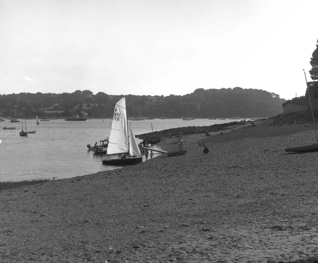
Photo: Dr Neil Clifton, CC BY-SA 2.0, via Wikimedia Commons
Trend palettes are easy to steal and even easier to forget. British coastal colour is different: it comes with weather, geology, paint, rust and a specific kind of grey that no mood board can invent. For makers building generative art, CSS heroes or little browser toys, local landscape is a better brief than whatever is trending on a design feed.
Below are ten UK coastal palettes written as hex, HSL and OKLCH. The HSL values are space-separated for modern CSS. The OKLCH values are there for relative colour work and smoother lightness shifts. Use them as starting points, then sample your own photos from the same stretch of coast.
1. Cornwall: slate and sea-glass
Hex: #2F3A3F · #6E8B8E · #A8C5C0 · #E7E1D3 HSL: 200 14% 22% · 184 12% 49% · 170 17% 71% · 45 26% 87% OKLCH: 0.29 0.02 220 · 0.58 0.03 190 · 0.78 0.03 175 · 0.91 0.02 85
Use it for a p5.js wave field: dark slate for the line work, sea-glass for the foam, warm chalk for the page. Keep labels in the darkest tone and let the middle two do the motion.
2. Norfolk: reed beds and marsh light
Hex: #3E4A32 · #7C8B57 · #C2B280 · #E6DCC3 HSL: 100 19% 24% · 80 18% 44% · 45 36% 63% · 43 42% 83% OKLCH: 0.34 0.04 130 · 0.58 0.06 115 · 0.78 0.06 90 · 0.89 0.04 85
A good fit for slow generative grass or reed textures. Use the olive as the base, the straw as highlight noise and the pale cream as the quiet space around the canvas. It also makes a calm hero gradient for a nature charity microsite.
3. Brighton: painted seafront
Hex: #F2C14E · #F78154 · #4D9DE0 · #1F2A36 HSL: 45 85% 63% · 16 91% 65% · 206 70% 59% · 210 27% 17% OKLCH: 0.82 0.14 85 · 0.72 0.16 45 · 0.65 0.13 240 · 0.24 0.03 240
This one is for playful work: a Three.js pier scene, a poster generator, a CSS confetti button. The navy is the anchor. The coral and blue are the seaside paint. Do not use the yellow for small text on white, however charming it looks.
4. Pembrokeshire: cliff and lichen
Hex: #5B4A3F · #A67C52 · #D9C3A9 · #3D6B5E HSL: 25 18% 30% · 30 41% 52% · 34 36% 76% · 163 27% 33% OKLCH: 0.38 0.03 55 · 0.58 0.08 65 · 0.82 0.04 75 · 0.47 0.05 170
Use the earth tones for rock forms and the green for the living edge. A shader that blends strata with lichen-like noise would suit this palette, especially if the green appears only in small patches rather than as a flat background.
5. Northumberland: black sand and pewter
Hex: #1C1F22 · #4A4E52 · #8C8F8A · #D6D1C4 HSL: 210 10% 12% · 210 5% 30% · 90 2% 55% · 45 16% 80% OKLCH: 0.20 0.01 250 · 0.37 0.01 240 · 0.60 0.01 120 · 0.84 0.02 85
A near-monochrome palette for moody generative landscapes. Try a Three.js coastline with fog and a single warm light. The cream is not white, which is the point: it keeps the scene from feeling clinical.
6. Hebrides: machair and shell sand
Hex: #2E5E4E · #7FA88A · #D8E2C4 · #F2E8C9 HSL: 160 34% 27% · 138 19% 58% · 78 35% 83% · 51 54% 87% OKLCH: 0.43 0.07 165 · 0.68 0.06 150 · 0.88 0.05 115 · 0.92 0.05 95
The green here is soft rather than acid. Build a p5.js dune field with layered curves, or use the pale sand as a background for a poetry microsite. Keep body text in the deep green and use the mid-green for illustration only.
7. Kent: chalk and dry grass
Hex: #F4F1E6 · #CFE0D6 · #7FA6A0 · #3A5A5A HSL: 48 38% 93% · 150 23% 85% · 175 17% 58% · 180 22% 29% OKLCH: 0.95 0.02 95 · 0.88 0.03 160 · 0.68 0.04 180 · 0.42 0.04 190
This is a clean palette for data-driven work: charts, maps, route planners. The deep teal is readable, the chalk is a generous surface and the middle teal works for lines and borders. Add one accent from your project, but keep the base quiet.
8. Devon: red earth and cream tea
Hex: #6B2F2A · #B65C3E · #E3A76F · #F2D8B3 HSL: 6 44% 29% · 17 49% 48% · 30 69% 66% · 35 67% 83% OKLCH: 0.38 0.08 30 · 0.55 0.12 40 · 0.75 0.09 60 · 0.88 0.05 75
Use this for warm generative posters or a CSS hero for a food and craft brand. The red-brown is the text-safe anchor. The peach and cream can carry large shapes, textures and scone-adjacent metaphors without becoming a pastel cliché.
9. Suffolk: shingle and faded paint
Hex: #5E5A52 · #918C7E · #C9C3B2 · #E8E2D2 HSL: 40 6% 35% · 40 8% 53% · 43 18% 74% · 43 30% 87% OKLCH: 0.43 0.01 85 · 0.60 0.02 85 · 0.79 0.03 85 · 0.90 0.03 85
A restrained palette for editorial layouts: a CSS grid of tide times, a photo essay, a quiet portfolio. Use the darkest tone for captions and the lightest as paper. It is the kind of palette that makes a single bright image feel deliberate.
10. Morecambe Bay: dusk and mudflat
Hex: #2B3A55 · #5E7FA3 · #C48A6A · #F2D0A4 HSL: 220 33% 25% · 213 28% 50% · 20 43% 59% · 35 76% 80% OKLCH: 0.32 0.05 265 · 0.55 0.07 250 · 0.65 0.09 45 · 0.85 0.07 70
Use this for a Three.js seascape at golden hour, or a p5.js sky that shifts from blue to warm haze. The blue is deep enough for text. The orange and sand tones are for light, reflection and atmosphere, not for tiny labels.
How to use these without making a coastal cliché
Pick one palette, then add one local detail: a photo, a place name, a tide table, a bit of dialect. The colours should support the story, not do all the talking. Check your text contrast before you fall in love with a gradient. And if you are sampling from your own photos, take five swatches from the same image rather than five from five different beaches. That is how you get a palette that feels like a place instead of a Pinterest board.