Jewel Tones Behind the Lead: A Stained-Glass Palette Generator for the Web
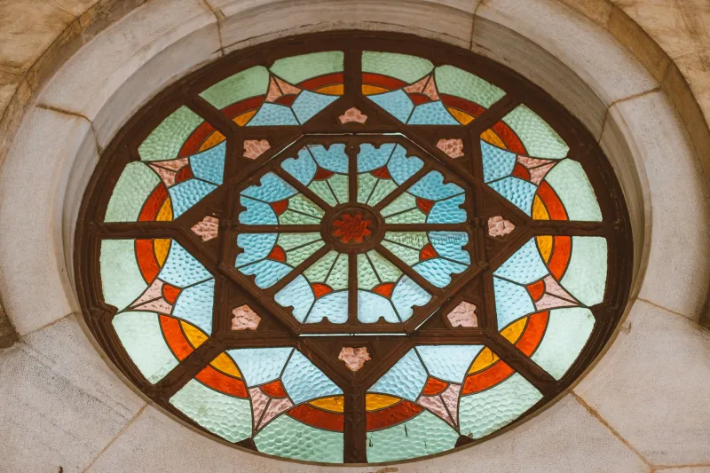
There is a particular kind of UK afternoon when the light drops low and a church window stops being decoration and starts acting like a screen. The glass goes deep and saturated; the lead turns into a hard black grid; the stone around it fades to grey. For a creative coder, that is not just a nice view. It is a palette with rules.
This is a small browser project: sample a few representative UK church windows, pull out their glass colours and lead-line rhythm, then turn the result into OKLCH tokens and a copyable CSS palette. The aim is not to recreate a window pixel-for-pixel. It is to borrow its colour relationships without borrowing its accessibility problems.
Pick windows like a colourist, not a tourist
Start with three to five windows that do different jobs. A medieval great window gives you dense, dark blues and rubies. A Victorian memorial window often brings brighter greens and amber. A postwar abstract window, such as the sort you find in Coventry Cathedral or smaller civic churches, can give you cleaner blocks and stranger combinations. A small chapel roundel is useful because the composition is simple enough to read at thumbnail size.
Use photographs you have taken yourself, or images with a clear licence. Backlit glass is already high contrast, so expose for the bright panes and let the surrounding stone go dark. Shoot as flat-on as you can; perspective correction is fine, but heavy HDR is not. The generator wants the window's colour logic, not a dramatic travel photo. Crop consistently, too. If one image includes half a stone pillar and another is all glass, your palette will reflect the crop more than the window.
Read the lead as structure
The lead lines are not just black outlines. They are the window's layout system. They decide where colours sit, how large each field is and how the eye travels. In code, treat lead as a separate material: collect very dark pixels, then measure the rough rhythm of gaps between them. That rhythm can become border widths, grid gaps, divider strips or the spacing between palette chips.
A window is a grid with interruptions. That is a useful model for a UI. The glass gives you the accents; the lead gives you the rules. Your generator can output two token sets: --glass-* for colour and --lead-* for structure. That keeps the pretty part from doing all the work.
Sample the glass in Canvas
Canvas is enough for this. You do not need WebGL to read a handful of images, and you do not need to process a 6000px photograph. Downscale first, then sample. A width of around 240px is plenty for colour clustering and keeps the loop cheap on phones.
async function sampleWindow(src) {
  const img = new Image();
  img.crossOrigin = 'anonymous';
  img.src = src;
  await img.decode();

  const c = document.createElement('canvas');
  const scale = 240 / img.width;
  c.width = 240;
  c.height = Math.round(img.height * scale);

  const ctx = c.getContext('2d', { willReadFrequently: true });
  ctx.drawImage(img, 0, 0, c.width, c.height);

  const { data } = ctx.getImageData(0, 0, c.width, c.height);
  const glass = [];
  const lead = [];

  for (let i = 0; i < data.length; i += 16) {
    const r = data[i];
    const g = data[i + 1];
    const b = data[i + 2];
    const max = Math.max(r, g, b);
    const min = Math.min(r, g, b);
    const luma = 0.2126 * r + 0.7152 * g + 0.0722 * b;
    const chroma = max - min;

    if (luma < 48) lead.push(luma);
    else if (chroma > 18) glass.push([r, g, b]);
  }

  return { glass, lead };
}
The i += 16 skips four pixels at a time. That is deliberate: it cuts work without losing the broad colour story. The chroma filter throws away grey stone and pale mortar. The luma filter keeps very dark pixels as lead candidates. If your window is underexposed, raise the lead threshold; if it is washed out, lower it. There is no universal number here, only a number that works for your set.
Cluster without a colour-science degree
You can reach for k-means, median cut or a proper quantiser, but a simple bucket sort gets you a usable palette surprisingly quickly. Round each channel into bins, average the bins, then take the largest ones.
function quantise(pixels, step = 32) {
  const bins = new Map();

  for (const [r, g, b] of pixels) {
    const key = [r, g, b].map(v => Math.round(v / step)).join('-');
    const bin = bins.get(key) || { r: 0, g: 0, b: 0, n: 0 };
    bin.r += r;
    bin.g += g;
    bin.b += b;
    bin.n += 1;
    bins.set(key, bin);
  }

  return [...bins.values()]
    .map(bin => ({
      r: bin.r / bin.n,
      g: bin.g / bin.n,
      b: bin.b / bin.n,
      n: bin.n
    }))
    .sort((a, b) => b.n - a.n)
    .slice(0, 8);
}
Eight clusters is a good default. Fewer feels blunt; more becomes a paint chart. Keep the cluster counts so you can weight the palette later: a colour that covers a third of the window should probably become your background field, not a tiny accent.
Turn clusters into OKLCH tokens
OKLCH is useful here because it lets you sort and adjust colours by perceived lightness and chroma without guessing. Use a small colour library rather than hand-rolling the maths in production.
import { converter, formatHex } from 'https://esm.sh/culori@4';

const toOklch = converter('oklch');

function toTokens(palette) {
  return palette.map((c, i) => {
    const rgb = { mode: 'rgb', r: c.r / 255, g: c.g / 255, b: c.b / 255 };
    const oklch = toOklch(rgb);

    return {
      name: `--glass-${i + 1}`,
      value: formatHex(oklch),
      l: oklch.l,
      c: oklch.c,
      h: oklch.h
    };
  });
}
Sort the tokens by lightness before you print them. That gives you a ramp you can reason about: dark glass, mid glass, bright glass. Then assign roles. The largest low-chroma colour becomes the field. The most saturated mid-tone becomes the accent. The lead colour becomes borders, rules and chips. Do not let every jewel tone fight for the same job.
Check contrast before you fall in love
OKLCH lightness is not a WCAG contrast ratio. A deep ruby and a deep blue can share a similar lightness and still behave differently against text. Run a contrast check on the actual pairs you intend to ship. Use the saturated glass colours for accents, headings or decorative blocks, not for long body copy. Pair them with a near-black or warm off-white that comes from the window's lead and stone.
A practical rule: if a colour came from glass, give it a job that can survive being loud. Links and buttons need an underline, a border or a shape as well as colour. Charts need labels. Palette chips need text labels outside the swatch. The window is allowed to be intense; the interface still has to be readable.
Keep the sketch light
The generator should feel instant on a modest laptop and merely warm on a phone. Downscale before sampling. Cache each result in localStorage keyed by image URL. Run the sampling inside requestIdleCallback if the page has other work to do. If you move to a worker, OffscreenCanvas can keep the main thread free.
If you add a WebGL preview, use one texture and avoid per-pixel work every frame. Cap device pixel ratio at 2, pause rendering when the tab is hidden and respect prefers-reduced-motion. A stained-glass generator does not need a 60fps particle system. It needs six good chips, a lead strip and a copy button.
Ship the small thing
The best version of this is not a grand tribute to ecclesiastical architecture. It is a small tool that shows a window, a lead rhythm and a set of tokens you can paste into a stylesheet. The UK has centuries of colour work sitting in churches, and most of it is already organised: glass inside lead, field around accent, light against dark. Borrow the structure, check the contrast, and let the browser do the rest.