Kerbside Signals: A Dark-Mode Token Set Built from UK Street Colours
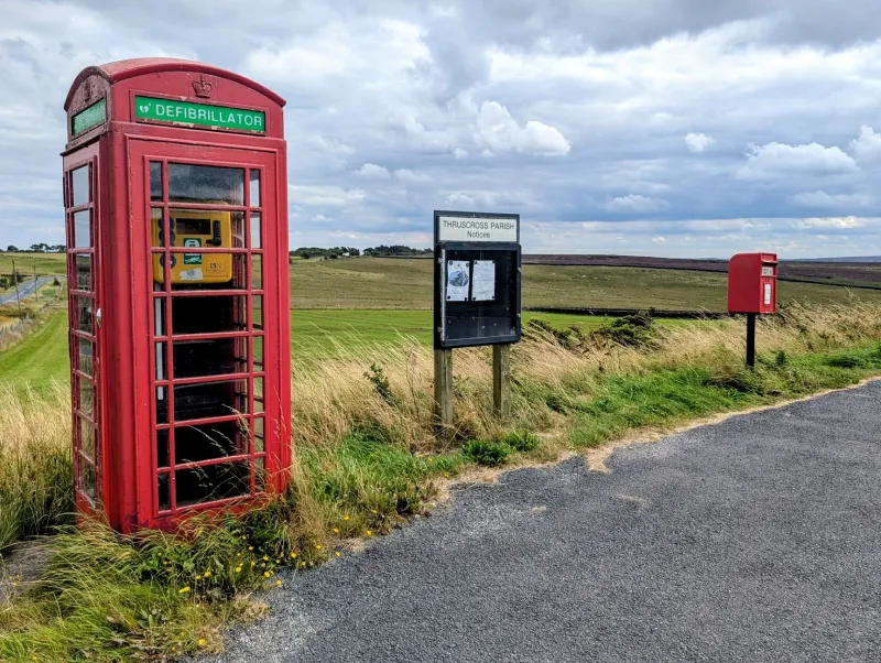
Street furniture is a colour system whether we notice it or not. A red pillar box says post; an amber globe says crossing; a blue panel says motorway; the grey flank of a bin lorry says municipal practicality. For anyone building UK-facing interfaces, those cues are tempting. They carry instant recognition and a bit of civic texture. The trap is novelty. Borrow the hues too literally and you get pastiche; borrow them without checking contrast and you get a palette that fails the people who need it most.
This is a practical route from kerbside colour to a compact CSS token set: four hues, a light and dark ramp, and an automated WCAG check that stops the whole thing drifting into decoration.
Four colours, four jobs
The first move is to stop thinking in swatches and start thinking in roles. Street furniture works because each colour has a job, not because the set looks nice together.
Pillar-box red is an alert and identity colour. The familiar red is often dated to the 1870s, after earlier boxes had been painted green to blend in; the switch was about visibility. In an interface, that translates to action and attention, but it is a poor choice for large backgrounds. Use it sparingly, the way a postbox uses it: a small, confident block against a quieter surface.
Belisha amber is a warning and crossing colour. The flashing globes arrived in 1934, named after Leslie Hore-Belisha, and they do one job: make a pedestrian crossing legible at a glance. On screen, amber is brilliant as a fill and terrible as small text on white. Treat it as a surface or a badge, with dark text on top.
Motorway blue is wayfinding. UK directional signs use blue for motorways and green for primary A roads, with reflective sheeting doing much of the work. You are not reproducing a traffic sign; you are borrowing the idea of a route colour. In a token set, blue is for navigation, links and selected states, not for every interactive element.
Bin-lorry grey is the neutral. It is not a standard colour, and that is the point. The grey of refuse vehicles, litter bins and street cabinets is a working neutral that lets the signal colours stay loud. In CSS, this becomes your surface and border family, with just enough chroma to avoid the dead grey of default UI.
Build the ramp in OKLCH
OKLCH is a good fit here because lightness, chroma and hue are separate. You can keep the civic hue recognisable while moving lightness for light or dark mode. Start with a small token module so the same values feed CSS and the contrast check.
export const tokens = {
  'signal-red': 'oklch(52% 0.19 27)',
  'signal-amber': 'oklch(78% 0.16 78)',
  'signal-blue': 'oklch(45% 0.12 255)',
  'signal-grey': 'oklch(62% 0.015 250)',
  'surface-light': 'oklch(98% 0.005 250)',
  'surface-dark': 'oklch(20% 0.01 250)'
};
Then generate semantic tokens. The names matter more than the raw values.
:root {
  --colour-action: var(--signal-red);
  --colour-warning: var(--signal-amber);
  --colour-route: var(--signal-blue);
  --colour-neutral: var(--signal-grey);
  --surface: var(--surface-light);
  --text: oklch(18% 0.01 250);
}

@media (prefers-color-scheme: dark) {
  :root {
    --colour-action: oklch(68% 0.16 27);
    --colour-warning: oklch(82% 0.14 78);
    --colour-route: oklch(72% 0.10 255);
    --colour-neutral: oklch(78% 0.01 250);
    --surface: var(--surface-dark);
    --text: oklch(94% 0.005 250);
  }
}
Notice what changed: hue stayed put, lightness moved, chroma came down slightly. That is the dark-mode trick. Do not invert the palette. Inverting a red gives you a pink that no longer reads as a postbox, and inverting amber gives you a muddy olive. Keep the hue anchor, lift the foreground lightness, and reduce chroma on large surfaces.
Check contrast before you fall in love
The Belisha amber is the warning here. At oklch(78% 0.16 78) it is lovely as a fill, but it will fail as text on white. That is not a reason to abandon it; it is a reason to pair it with dark text.
WCAG 2.2 AA asks for 4.5:1 for normal text and 3:1 for large text and UI components. If you are working with a UK public-sector client, the accessibility regulations make this a requirement rather than a preference. A quick Node script with colorjs.io can check every foreground and background pair in the token file before the CSS ships.
import Color from 'colorjs.io';
import { tokens } from './tokens.js';

const pairs = [
  ['signal-red', 'surface-light', 4.5],
  ['signal-blue', 'surface-light', 4.5],
  ['signal-amber', 'surface-light', 3],
  ['signal-grey', 'surface-light', 3]
];

let failed = false;

for (const [fg, bg, minimum] of pairs) {
  const ratio = new Color(tokens[fg]).contrast(tokens[bg], 'WCAG21');
  if (ratio < minimum) {
    console.error(`${fg} on ${bg}: ${ratio.toFixed(2)}:1, needs ${minimum}:1`);
    failed = true;
  }
}

if (failed) process.exit(1);
Run that in CI and you have a guardrail. It will not tell you whether the palette feels right, but it will stop the obvious failures.
Dark mode without losing the signal
Dark mode is where civic palettes usually go wrong. The temptation is to crank saturation so the colours pop against a near-black surface. Resist it. Highly saturated red and blue on dark backgrounds can vibrate, and amber can bloom into a glare.
A few practical rules:
- Keep the hue angle stable, but raise lightness for foreground tokens and lower chroma for surfaces.
- Test amber as a fill with dark text, not as text on a dark background.
- Give grey a little warmth or coolness rather than using pure neutral; it keeps the palette from feeling clinical.
- Support
prefers-contrast: moreby increasing border and text contrast, not by adding more colour.
@media (prefers-contrast: more) {
  :root {
    --text: oklch(12% 0.01 250);
    --colour-neutral: oklch(50% 0.02 250);
  }
}
Where to stop
Street furniture is not a brand kit. A postbox red token should not turn your checkout button into a novelty postbox, and a Belisha amber badge should not flash. The point is to borrow the semantic clarity, not the object.
There is also a cultural line. These colours carry local meaning, and some of them are regulated in the real world. You are making a screen palette, not a traffic sign. Say so in your comments, keep the token names semantic, and leave the official standards to the people who paint the streets.
Done well, a kerbside palette gives UK makers something rare: a colour system with a reason to exist. Postbox red, beacon amber, motorway blue and bin-lorry grey are not just nice hues. They are a small lesson in how colour can guide without shouting. Build the tokens, check the contrast, tune the dark mode, and let the civic cues do their quiet work.