Laying Bricks in Code: Procedural British Materials for p5.js Sketches
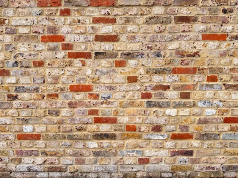
British materials are a cheat code for texture. A wall of London stock brick is not one colour; it is burnt orange, mustard, soot and lime mortar arguing in the rain. Welsh slate carries blue-grey striations that look almost digital. Weathered copper gives you verdigris without opening a paint tin. Portland stone is the pale, speckled base note under half of London.
The trick is not to draw a photoreal brick. It is to capture the colour behaviour — the way those materials shift under a grey UK sky — and turn it into something procedural. p5.js is ideal for that: quick to sketch, easy to export, and happy running in a browser tab. Here is a practical workflow for building reusable material tiles.
Sample the reference before you write a line of code
Take a few photos in flat daylight, not direct sun. Crop tight to the material, avoid white balance tricks, and sample six to ten colours from each image. Note the hex values, then convert them to HSB or OKLCH for manipulation. You want a palette with range: a light mortar, a mid brick, a dark soot, and one odd colour that stops it looking like a spreadsheet.
A simple p5.js palette object keeps things tidy:
const stockBrick = {
  brick: ['#b46b3f', '#c98a55', '#8f4f32', '#d6a06a'],
  mortar: '#d8cbb6',
  soot: '#5f5148'
};
Use randomSeed() so the tile is repeatable. A texture you cannot reproduce is a texture you cannot debug.
Build the brick pattern as a module, not a mood
London stock brick is a rhythm: courses, joints, half-brick offsets. Start with a canvas that is an exact multiple of the brick module, otherwise the repeat will show a seam. A brick of 64 by 24 pixels with a 4-pixel joint is a good starting point. Loop through rows, offset every other row by half a brick, and pick a fill from the palette for each brick.
function drawBrick(g, palette) {
  g.background(palette.mortar);
  const bw = 64, bh = 24, joint = 4;
  for (let y = 0; y < g.height; y += bh + joint) {
    const offset = (floor(y / (bh + joint)) % 2) * (bw / 2);
    for (let x = -bw; x < g.width + bw; x += bw + joint) {
      g.noStroke();
      g.fill(random(palette.brick));
      g.rect(x + offset, y, bw, bh);
    }
  }
}
That gets you the structure. The character comes from the layers: a low-opacity noise wash for soot, slightly uneven mortar lines, and a few bricks that are almost too dark. Resist the urge to add a drop shadow. Real brick is flat and dirty, not embossed.
Slate, copper and stone: three more recipes
Welsh slate is mostly a line pattern. Fill with a dark blue-grey, then draw hundreds of thin horizontal strokes with small random vertical offsets. Keep the contrast low. Slate should feel like a surface that has been rained on for a century, not a barcode. A little noise at 5% opacity is enough.
Weathered copper needs a base of warm brown-orange and a second layer of verdigris. Use noise() at a coarse scale to decide where the green patches sit, then blend a teal-green over the base with low alpha. Add a few brighter specks where the metal has worn. The mistake is making the green too clean. Verdigris is chalky and uneven.
Portland stone is the quiet one. Start with a pale cream-grey, add thousands of tiny speckles in slightly darker and lighter tones, and keep the whole thing low contrast. A few faint fossil-like arcs can add interest, but they should be barely there. This is the texture you use when you want colour without noise.
Layer noise without melting the frame rate
noise() is brilliant, but it is not free. Do not call it per pixel inside draw() on every frame. Render the texture once into a p5.Graphics buffer, then display that buffer. Use noLoop() for static tiles. If you need animation, animate a small number of parameters, not the whole pixel grid.
For repeat patterns, design to the module. Brick and slate tiles can be seamless if the canvas dimensions are exact multiples of the pattern. Organic noise is harder. The quick fix is to blend a 32-pixel strip from the opposite edge over each side. The better fix is a seamless noise function, but for most creative-coding tiles the blend is fine.
Keep the browser happy
pixelDensity(1) is your friend when exporting. A 512 by 512 tile is plenty for a web background; 1024 is fine for a hero image. Pre-render palettes as constants, cache generated graphics, and avoid rebuilding the same texture on every resize. If you are using the tile as a CSS background, export a PNG or WebP, keep the file size sensible, and set background-repeat: repeat on the element.
Also think about where the texture sits. Busy brick behind body text is a readability tax. Use it in a header band, a card edge, or a footer, and keep the reading surface calm. Colour-rich does not have to mean everywhere at once.
Export tiles you can actually use
Once the tile looks right, export it from the graphics buffer:
function exportTile(g, name) {
  g.pixelDensity(1);
  saveCanvas(g, name, 'png');
}
Name files by material and size: london-stock-512.png, welsh-slate-512.png. Keep a small palette JSON next to them so you can rebuild the set later. Then drop the tiles into a sketch, a website background, or a print mock-up. The point is not to fake a wall. The point is to carry the colour memory of British materials into your code.
Start with one material. Get the palette honest, the pattern repeatable, and the export clean. Then build the set.