Mooring Lines and Contrast Ratios: A Canal-Boat Palette for the Web
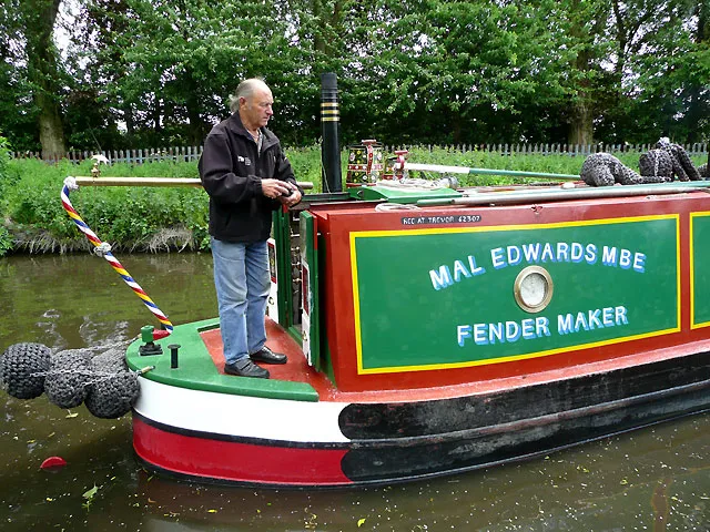
Photo: Roger Kidd, CC BY-SA 2.0, via Wikimedia Commons
Traditional narrowboat livery is one of the great British colour systems hiding in plain sight. A working boat yard might dress a hull in deep maroon, pick out the cabin in cream, run a teal line along the guard, and finish with mustard diamonds and a rose-and-castle panel. It is bold, cheerful and deeply practical: colours chosen to read from the towpath, not from a colour wheel. That makes it a useful starting point for web palettes — as long as we do not try to upload the whole boat.
Sample the cut, then simplify
Spend an afternoon at Braunston, Stoke Bruerne or any local marina and you will see more variation than a single paint chart suggests. Some boats go for a sober working-boat look; others lean heavily into folk art, with roses, castles, diamonds and scrollwork. The temptation is to sample every panel and end up with twenty muddy tokens. Resist it.
Instead, sample by role. The hull gives you the anchor dark. The cabin sides give you the main surface. The guard and handrails give you a secondary colour. Mustard or yellow usually works as the highlight. Rose red belongs to decoration, not body copy. Once you have reduced the boat to five or six jobs, the palette starts behaving like a design system rather than a photograph.
From paint tin to design token
OKLCH is a good fit for this because lightness is perceptual: you can darken a teal for links without watching it turn into a different colour family. A starter set might look like this:
:root {
  --nb-hull: oklch(0.32 0.09 25);
  --nb-cream: oklch(0.94 0.035 85);
  --nb-teal: oklch(0.48 0.09 195);
  --nb-mustard: oklch(0.78 0.14 85);
  --nb-rose: oklch(0.56 0.16 15);
  --nb-ink: oklch(0.22 0.02 60);

  --surface: var(--nb-cream);
  --text: var(--nb-ink);
  --link: oklch(0.38 0.08 195);
  --accent: var(--nb-mustard);
  --accent-ink: var(--nb-ink);
}
The important move is separating paint names from interface roles. --nb-rose can decorate a border or an illustration; --accent-ink tells you what text is allowed to sit on the mustard. That stops a cheerful boat colour from quietly becoming an unreadable button label.
A small generator with guardrails
You do not need a full design tool to explore variations. A short script can take a seed palette and clamp the values that most often cause trouble: hulls that are too light, creams that are too dark, and accent chroma that screams rather than sings.
const seed = {
  hull:    { l: 0.32, c: 0.09, h: 25 },
  cream:   { l: 0.94, c: 0.035, h: 85 },
  teal:    { l: 0.48, c: 0.09, h: 195 },
  mustard: { l: 0.78, c: 0.14, h: 85 },
  rose:    { l: 0.56, c: 0.16, h: 15 }
};

const toOklch = ({ l, c, h }) => `oklch(${l.toFixed(2)} ${c.toFixed(3)} ${h})`;

function buildBoatPalette(seed) {
  const safe = {
    ...seed,
    hull: { ...seed.hull, l: Math.min(seed.hull.l, 0.38) },
    cream: { ...seed.cream, l: Math.max(seed.cream.l, 0.92) },
    teal: { ...seed.teal, c: Math.min(seed.teal.c, 0.10) },
    mustard: { ...seed.mustard, c: Math.min(seed.mustard.c, 0.15) }
  };

  return {
    '--nb-hull': toOklch(safe.hull),
    '--nb-cream': toOklch(safe.cream),
    '--nb-teal': toOklch(safe.teal),
    '--nb-mustard': toOklch(safe.mustard),
    '--nb-rose': toOklch(safe.rose),
    '--nb-ink': toOklch({ l: 0.22, c: 0.02, h: 60 })
  };
}

document.documentElement.style.cssText += Object.entries(buildBoatPalette(seed))
  .map(([key, value]) => `${key}: ${value};`)
  .join(' ');
Those clamps are guardrails, not a guarantee. They keep the palette in the right neighbourhood; they do not prove that every pairing is accessible.
Contrast is the lock gate
Before you put mustard text on cream, stop. A canal boat can get away with low-contrast decorative panels because the shapes are large and the viewing distance is generous. A web page cannot. In 2026, WCAG 2.2 AA remains the sensible baseline for most UK public, charity and maker-facing sites: 4.5:1 for body text, 3:1 for large text and meaningful interface boundaries.
The reliable pattern here is ink on cream for body copy, and dark teal for links on cream. Mustard works as a block colour with ink text on top, or as a decorative underline, not as a paragraph colour. Rose red is lovely in an SVG rose-and-castle motif; it is a poor choice for form labels. Keep the folk art in the illustration layer and let the interface layer stay boringly legible.
Test the result with axe DevTools, Lighthouse or a contrast checker that understands OKLCH. Then do the less automated checks: tab through the page, zoom to 200%, and simulate a couple of colour-vision deficiencies. If the boat palette still reads clearly, you have something worth keeping.
The trim is where the joy lives
A narrowboat palette does not need to turn a website into a floating souvenir. Use the hull colour for headers or footers, cream for the page surface, teal for links and rules, and mustard for small moments of emphasis. Add the rose red as a border, a marker or a tiny piece of generated decoration. The result feels canal-side without becoming a pastiche.
For UK makers, that is the useful lesson: the romance is in the trim, but the structure has to hold. Sample the paint, simplify the roles, generate a few options, and let contrast decide which ones leave the dry dock.