Flicking the Switch: A Tabletop-Football Palette That Survives Tiny Screens
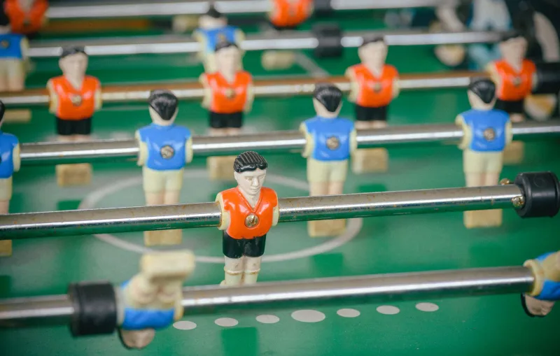
Subbuteo was never really about football. It was about the flick, the little plastic base, and the fact that a claret-and-blue winger could be identified from across the room by colour alone. That is a useful design brief for the web too — especially when the room is a phone screen and the winger is a 12px status badge.
At CodeChroma we like palettes with a bit of history. But nostalgia is not an excuse for an accessibility own goal. So here is a compact workflow: borrow the strips, name the colours properly, check the contrast of the smallest controls, then build a CSS Grid pitch and a small procedural match-day scene that still behaves.
Name the kits, not just the hex
A palette built from tabletop football needs names that mean something to a UK maker. Calling a colour --secondary-3 is technically fine and emotionally useless. Instead, name by kit and role: --kit-claret, --kit-amber, --kit-sky, --ref-black, plus pitch and chalk neutrals. Then add a semantic layer on top: --ui-text-strong, --ui-surface, --ui-focus, --ui-danger. That way the nostalgic names stay playful while the components stay sensible.
A starter set could look like this:
:root {
  --pitch-green: #316b3b;
  --pitch-chalk: #f7f3e8;
  --kit-claret: #7a1f3d;
  --kit-amber: #f2a900;
  --kit-sky: #79c7e3;
  --ref-black: #151515;

  --ui-surface: var(--pitch-chalk);
  --ui-text-strong: var(--ref-black);
  --ui-accent: var(--kit-claret);
  --ui-focus: var(--kit-amber);
}
Those hex values are a starting point, not gospel. Sample your own reference — a scan of a 1970s team card, a programme, a photograph of a battered box — and keep the spirit rather than the exact ink. The important part is that each colour has a job.
The tiny-element trap
Here is where a toy aesthetic can turn into a proper accessibility problem. Tiny UI elements are usually tiny and low-contrast and colour-coded. A small amber badge on a cream card may look charming in a mock-up; at 11px it is a squint. A sky-blue dot against white is worse. Referee black is not a magic eraser either — black on claret is only around 1.8:1, which is not enough for text or meaningful icons.
As a planning rule, aim for at least 4.5:1 for normal-size text, and treat 3:1 as the floor for meaningful non-text UI such as borders, icons and focus indicators. For genuinely tiny controls — under 16px, or anything sitting in a dense toolbar — give yourself headroom and aim higher. Also check target size: WCAG 2.2 asks for at least 24 by 24 CSS pixels for pointer targets, and 44px is a kinder default for touch.
Some practical combinations from the set above:
- Claret on chalk: strong enough for body text and small labels.
- Referee black on amber: excellent for tiny badges.
- Referee black on sky: excellent for tiny badges.
- Chalk on pitch green: good for pitch markings and labels.
- Amber on chalk: poor for text. Use it as a fill, not as the letters.
- Sky on chalk: poor for text. Same rule.
- Referee black on claret: do not use it for small type or icons.
My numbers are approximations for planning; verify with your own contrast tool and, ideally, a manual check in the browser. If you are building a design system, put those checks in a token test rather than relying on memory.
Make colour share the load
Do not let kit colour be the only signal. In a match-day UI, a player card can have a claret fill, an amber fill or a sky fill — but it should also carry a label, a stripe pattern, a role icon or a shape difference. That is not decoration. It is redundancy. It helps colour-blind users, and it helps everyone on a sunny bus with a smeared screen.
For focus states, use a double ring: an amber outer ring plus a dark inner ring. Amber alone on cream can vanish; the dark edge keeps it visible. Keep the ring at least 2px and do not remove outlines without replacing them.
Build the pitch with CSS Grid
A CSS Grid pitch is a nice low-cost way to get the tabletop feel without an image-heavy page. The pitch is a grid; the players are buttons or links placed into grid areas. Keep the markup simple and give every player an accessible name.
<div class='pitch' role='group' aria-label='Tabletop football pitch preview'>
  <button class='player claret' aria-label='Claret number 9'>9</button>
  <button class='player amber' aria-label='Amber number 4'>4</button>
  <button class='player sky' aria-label='Sky number 7'>7</button>
</div>
.pitch {
  display: grid;
  grid-template-columns: repeat(5, 1fr);
  grid-template-rows: repeat(4, 1fr);
  gap: 0.75rem;
  aspect-ratio: 3 / 2;
  padding: 1rem;
  background: var(--pitch-green);
  border: 4px solid var(--pitch-chalk);
}

.player {
  min-width: 44px;
  min-height: 44px;
  border: 2px solid var(--ref-black);
  border-radius: 999px;
  font: inherit;
  font-weight: 700;
  color: var(--ref-black);
  background: var(--kit-amber);
}

.player.claret { background: var(--kit-claret); color: var(--pitch-chalk); }
.player.sky { background: var(--kit-sky); }
.player:focus-visible {
  outline: 3px solid var(--kit-amber);
  outline-offset: 3px;
  box-shadow: 0 0 0 6px var(--ref-black);
}
The claret button uses chalk text because black on claret is too tight. Amber and sky use referee black. The border is not just vintage trim; it gives the small round control a hard edge against the pitch.
A procedural match-day scene on canvas
For a bit of motion, draw a small canvas scene: a pitch, a ball, and a few simplified players. Keep it decorative, not the only place where information lives. If it is decorative, mark it as such; if it carries meaning, provide a text alternative. Respect reduced motion.
const canvas = document.querySelector('.match-canvas');
const ctx = canvas.getContext('2d');
const reduce = matchMedia('(prefers-reduced-motion: reduce)').matches;
let t = 0;

function draw() {
  const { width: w, height: h } = canvas;
  ctx.fillStyle = '#316b3b';
  ctx.fillRect(0, 0, w, h);

  ctx.strokeStyle = '#f7f3e8';
  ctx.lineWidth = 4;
  ctx.strokeRect(16, 16, w - 32, h - 32);

  const x = w / 2 + Math.cos(t) * w * 0.18;
  const y = h / 2 + Math.sin(t * 1.3) * h * 0.12;
  ctx.fillStyle = '#f2a900';
  ctx.beginPath();
  ctx.arc(x, y, 8, 0, Math.PI * 2);
  ctx.fill();

  t += 0.01;
  if (!reduce) requestAnimationFrame(draw);
}

draw();
That snippet is deliberately small. For production, scale for device pixel ratio, pause when off-screen, and offer a static frame when reduced motion is requested. The palette does the heavy lifting: pitch green, chalk lines, amber ball. No extra colours required.
The final whistle
A tabletop-football palette is a lovely thing: claret, amber, sky, referee black, and a pitch that smells of old cardboard. The trick is to let the nostalgia live in the names and the composition, not in fragile 1px hairlines and colour-only signals. Name the kits, test the tiny stuff, add redundant cues, and keep the focus ring loud. Then the little plastic players can flick their way onto the web without taking accessibility out at the knees.