The Virtual Signwriter: Coach-Enamel Colours in p5.js
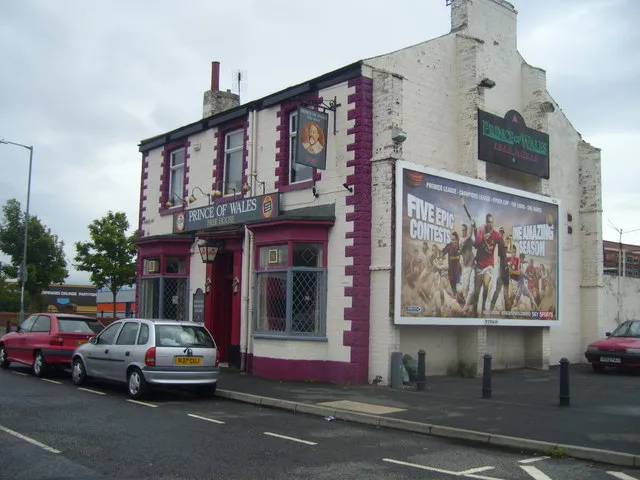
Photo: Ian Barton, CC BY-SA 2.0, via Wikimedia Commons
Pub signs are one of those bits of British design that everyone recognises and almost nobody codes. They sit at the crossroads of signwriting, heraldry, landlord pride and a very specific kind of high-street glamour. Cream signboards. Gold leaf catching the light. Deep Brunswick green. A signwriter's red that looks like it has been mixed by someone who knows exactly what they are doing.
That makes them a brilliant starting point for a generative tool. Not a pub-sign generator that spits out the same fake crest every time, but a small p5.js painter that lets you compose a board, rough up the edges, export an SVG and check that the colours still work when the whole thing is shrunk to a thumbnail on a phone.
Start with a signwriter's palette
The palette is the easy bit, as long as you resist the urge to make it too neat. Traditional coach enamel is glossy and slightly inconsistent. On screen, that means using saturated colours but not neon ones, and giving yourself a dark ink for the lettering rather than pure black.
const PALETTE = {
  cream: '#F1E3C6',
  gold: '#C9A227',
  brunswick: '#1F4D3A',
  signRed: '#B23A2E',
  ink: '#141414'
};
Cream is the ground. Brunswick green and signwriter's red are the workhorses. Gold is the accent, and it should stay an accent: gold leaf on a cream ground is beautiful in real life and nearly invisible on a screen if you try to use it for body text.
Compose the board, not just the type
A pub sign has a hierarchy. There is a border, a panel, a bit of ornament, the name of the house and maybe a date or a landlord's name. Your code should reflect that rather than dropping random letters into a rectangle.
Start with a 3:2 board. Draw the cream ground, then an inset panel in Brunswick green or red. Leave a generous margin. Signwriters do not crowd the edge, and neither should you.
function drawSign() {
  background(PALETTE.cream);
  noFill();
  stroke(PALETTE.ink);
  strokeWeight(8);
  rect(24, 24, width - 48, height - 48);

  fill(PALETTE.brunswick);
  noStroke();
  rect(56, 56, width - 112, height - 112);

  fill(PALETTE.cream);
  textAlign(CENTER, CENTER);
  textFont('Georgia');
  textStyle(BOLD);
  textSize(72);
  text('The Crown', width / 2, height / 2 - 20);
}
That is the skeleton. The character comes from the interruptions: a hand-painted border, a little gold rule, a slightly wonky underline.
Fake the brush, keep the vector
A real sign is painted with a mahl stick, a steady hand and a brush that loads unevenly. In p5.js, you can suggest that without simulating every bristle. The trick is to replace clean lines with slightly wobbly paths made from a handful of points.
function brushLine(x1, y1, x2, y2, col, weight) {
  stroke(col);
  strokeWeight(weight);
  noFill();
  const steps = 18;
  beginShape();
  for (let i = 0; i <= steps; i++) {
    const t = i / steps;
    const x = lerp(x1, x2, t) + random(-1.5, 1.5);
    const y = lerp(y1, y2, t) + random(-1.5, 1.5);
    vertex(x, y);
  }
  endShape();
}
Use that for borders, underlines and the little flourishes around the lettering. Keep the lettering itself crisp. A sign that looks drunk is not charming; it is just hard to read.
Export something a maker can actually use
The point of a tool like this is not only to make a PNG for a mood board. If you are working with a maker, a signwriter or a laser cutter, an SVG is far more useful. You can build one by collecting SVG fragments in an array and joining them at the end.
function svgPath(x1, y1, x2, y2, col, weight) {
  const jitter = () => (Math.random() - 0.5) * 3;
  const d = `M ${x1} ${y1} Q ${(x1 + x2) / 2 + jitter()} ${(y1 + y2) / 2 + jitter()} ${x2} ${y2}`;
  return `<path d='${d}' stroke='${col}' stroke-width='${weight}' fill='none' stroke-linecap='round'/>`;
}
That gives you brush-like curves that survive scaling. For text, either embed a font you have the licence to use or convert the lettering to outlines in Inkscape before handing it over. A signwriter will thank you for paths, not a mystery font reference.
Keep it legible above the door and on the screen
The last step is the one that separates a pretty sketch from a useful tool. Pub-sign colours are often low contrast by design: gold on cream, red on green, dark green on black. That can work at two metres on a sunny wall and fail completely at 320 pixels wide on a phone.
Add a contrast check. You do not need a library for this.
function hexToRgb(hex) {
  const n = parseInt(hex.slice(1), 16);
  return [(n >> 16) & 255, (n >> 8) & 255, n & 255];
}

function luminance(hex) {
  const rgb = hexToRgb(hex).map(v => {
    const s = v / 255;
    return s <= 0.03928 ? s / 12.92 : Math.pow((s + 0.055) / 1.055, 2.4);
  });
  return 0.2126 * rgb[0] + 0.7152 * rgb[1] + 0.0722 * rgb[2];
}

function contrast(a, b) {
  const l1 = luminance(a);
  const l2 = luminance(b);
  const light = Math.max(l1, l2);
  const dark = Math.min(l1, l2);
  return (light + 0.05) / (dark + 0.05);
}
Now you can decide rules for your generator. Brunswick green on cream is solid. Signwriter's red on cream is usually workable for large lettering but needs checking for smaller text. Gold on cream should be decoration only. If the contrast ratio drops below 4.5:1 for body text, nudge the ink darker or lighten the ground.
That check does not make the palette boring. It just means the sign still works when it is not hanging above a door in perfect light. Which, for a web tool, is most of the time.